
A Beautiful Place to Live In
When I received this project inquiry earlier this year, the then-potential client had one requirement that stuck out the most to me . . . “I just want a beautiful place for my family to live and entertain in.”
And that very sentence is what became my mission.
The Beginning
For this project, we were asked to add a bit of color, life and love to three spaces. They simply wanted their home to feel comfortable and happy! And y’all know how much I love spreading #asenseofhappy through my designs!
So let’s take a look at the spaces!

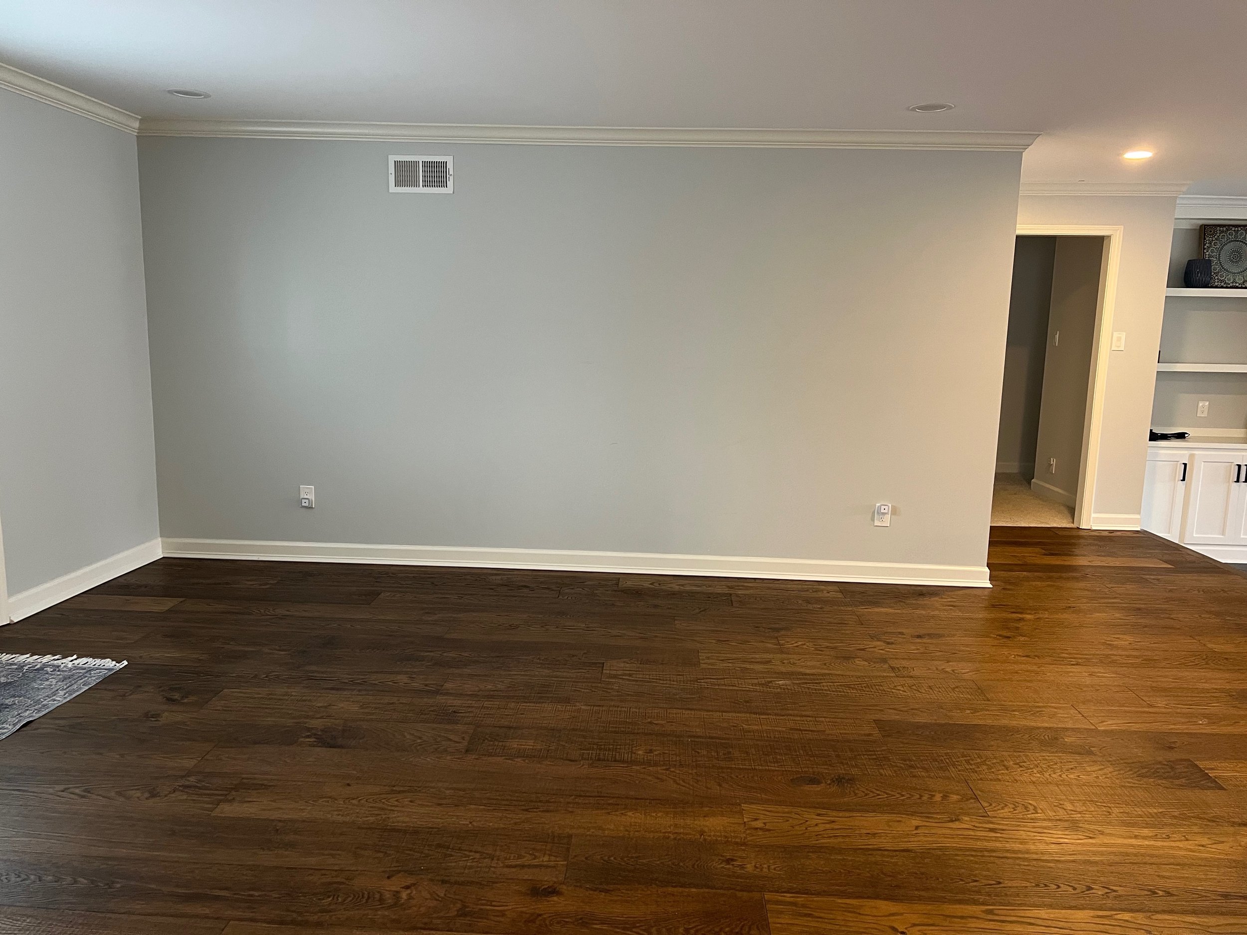
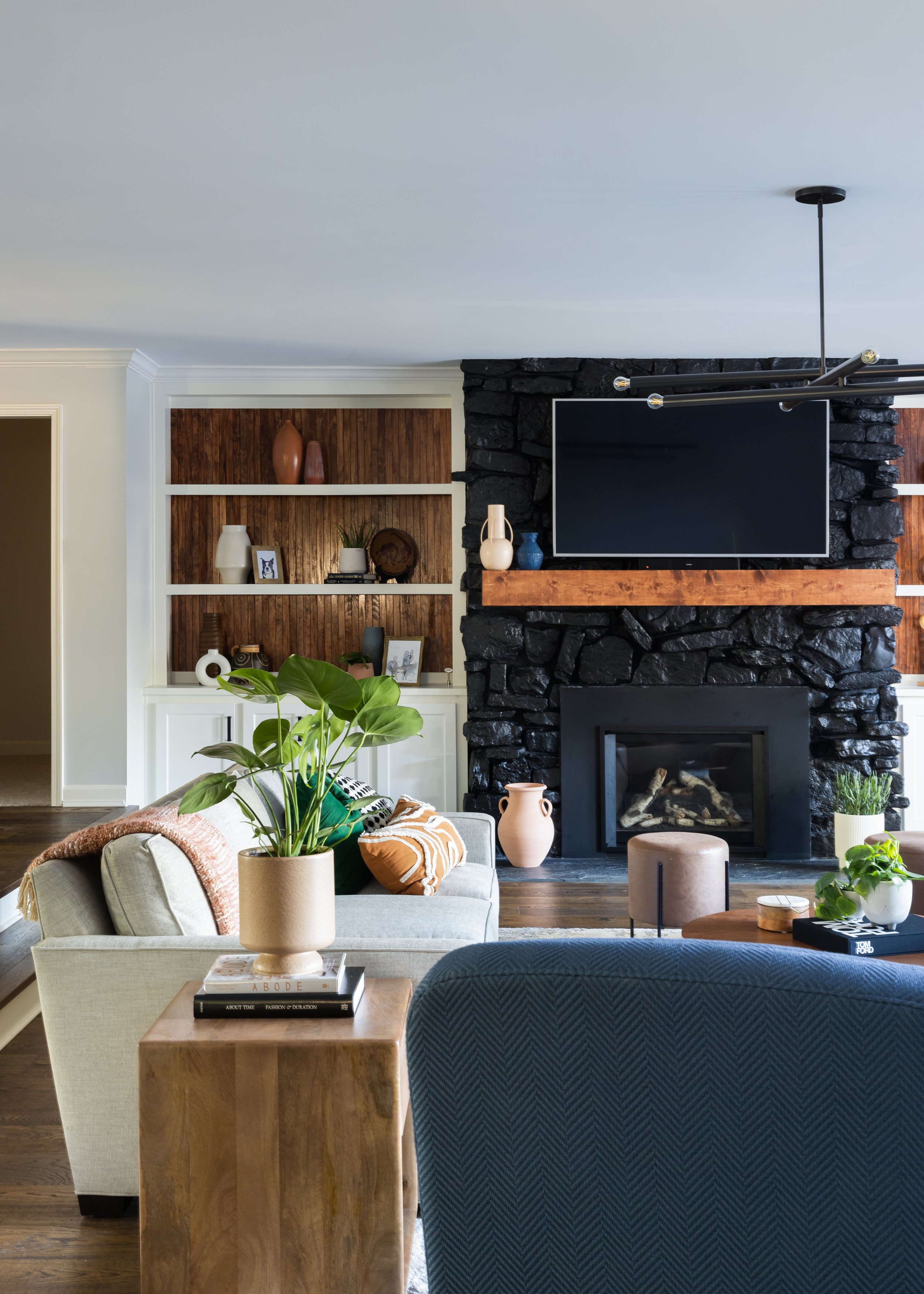
Upon first sight, I fell in love with this space! It already had SO much potential. I mean, do you see those beautiful hardwood floors? And I liiiiiive for a sunken den. Oh, and that fireplace? A dream!

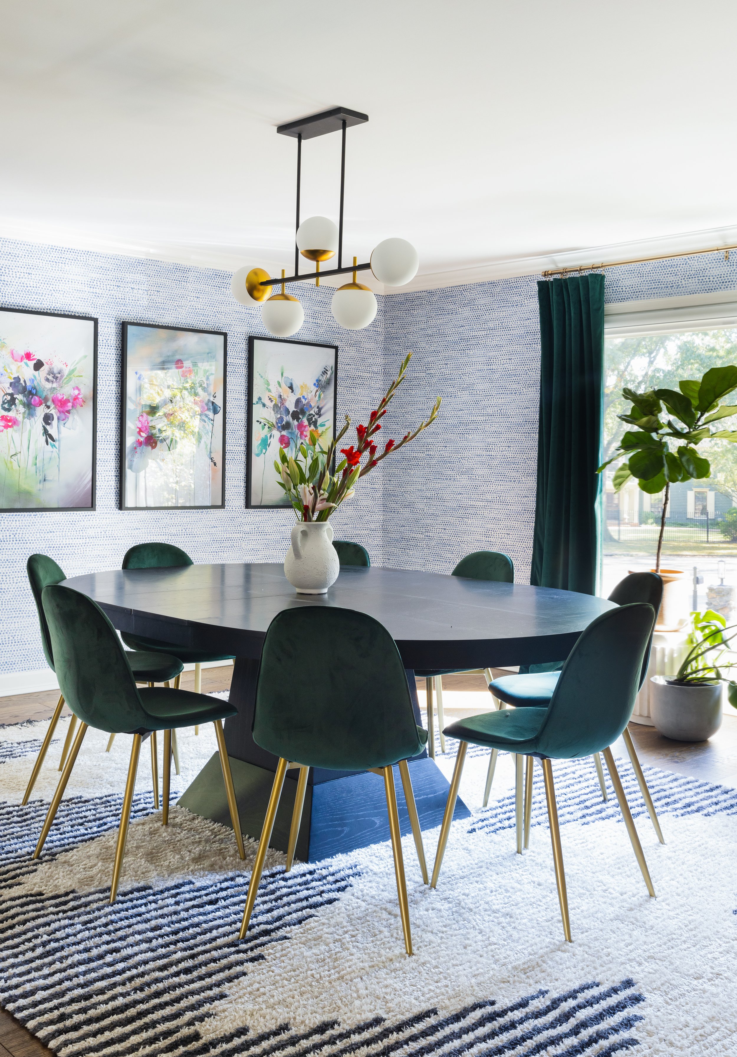
Like in the den, I instantly connected with their formal dining room. The picture window stole my heart, and I remember saying to myself that this room felt like a blank canvas - which ultimately led to my design choices down the road. I knew immediately that since this was the smaller of the gathering spaces in the home, I’d really like to make use of color and movement on these walls!
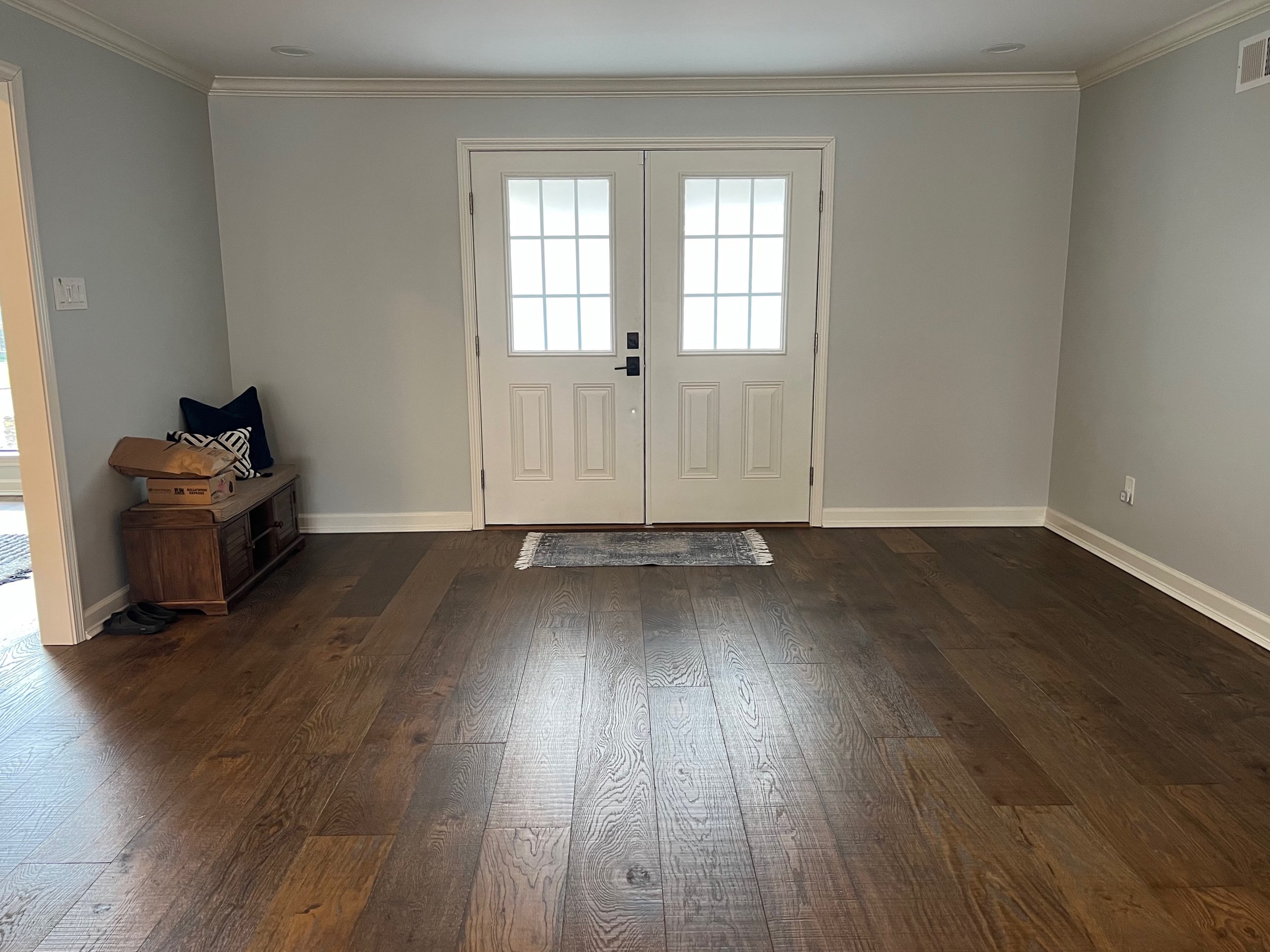
The entryway, however, was the one place I was initially stumped. Although it, too, was a blank canvas, its layout was a bit awkward. This portion of the home is spacious and opens up to a beautiful view of the den and backyard. However, to the left, there is a long wall that was screaming for some attention, and to the right, there’s a rather wide opening that leads into the dining room.
This is where it is really important to ask the client the right questions concerning how they want to use their spaces. And in our initial consultation, the family expressed their same challenge with the space, but they knew they wanted it to feel welcoming while serving as a place for storage and hanging coats for when they or guests arrived.
I had my fun homework cut out for me, and from the consultation I knew I wanted to make the following changes:
Replace and modernize the lighting, especially in the den - where I would like to remove the two flush mounts and replace them with a single fixture that would define the space, address the size accordingly and serve as an aesthetic focal point.
Add COLOR - but not too much. The family expressed their love for blues and greens, and their disdain for red. Knowing that, I’d pivot a little in introducing a third and balancing color to their plan.
Give their den a contrasting element all while making sure that the dining room was “in the same conversation without saying the same words” . . . and the fireplace was going to be my area to hone in on that contrast.
Last, but not least, bring in visual warmth and that cozy feeling through their furniture and accessories. And to show a bit of their personality and style, I’d use the shelves to display items that spoke to who they are.
The Plan

By the end of each consultation, I pretty much have an idea of the color palette and design plan for the spaces we’ll work in. This is in large part due to each client filling out a survey, asking questions concerning their personal style and preferred and least liked colors, textures . . . we even get as specific as asking what song inspires your vision for your home/would you imagine yourself listening to in each space.
From both the consultation and survey, I knew that emerald green and blues were what the family wanted to see in their home. And since we would be keeping some keep pieces of furniture, like their dining table and green chairs, I had a jumping-off point to really inspire the overall design.
If you remember me briefly stating above, I’d said to myself that the dining room was like a blank canvas and the walls were screaming for color and movement. So, in the spirit of art and canvases, I proposed a watercolor print wallpaper to achieve both of those design goals.

Proposed lighting: another way to make sure each room in the design plays well with the next is ensuring that the lighting selections are - not the same - but in at least the same family of design and finish.
This way, we’d maximize the usage of the walls in the smaller space by infusing the most color so that once in the den and entryway, through decorative accessories and plants, we could cohesively tie the rooms together. I thought of the dining room as the home base, allowing its concentration of colors and patterns flow throughout the rest of the spaces in the home.
Once this was approved by the client, the rest of the design came to me almost immediately! And it was time to bring this vision to life!
Want to see what we came up with?
The Result
Photography: Sarah Rossi | Artwork: Whitney Winkler
For me, dining rooms are the heart and soul of a home. This is where relationships - friends and family - are newly formed and strengthened, all over good food, good conversation . . . a your beverages of choice. So I really pour into these rooms in each design; especially for families!
Design Notes:
The wallpaper appropriately addressed bringing the color and movement I desired to achieve in this room. This was a way to introduce color on the walls in an impactful, yet soft way for this family. And since there was a pattern present in the existing rug, when pattern mixing my rule of thumb is to choose one bold and one subtle pattern to exist and thrive together.

Photography: Sarah Rossi

Photography: Sarah Rossi
As with pattern mixing, I apply the same methodology to choosing artwork. Now, the client sought out and knew immediately that they wanted those beautiful floral prints by local artist Whitney Winkler. So, for the other artwork in the space, I wanted it to speak to shapes and textures that occurred in other decorative elements and/or background features in the floral prints. The vase and these textured canvas pieces seem to be having a beautiful conversation, and I am here for it!

Photography: Sarah Rossi | Entryway table and mirror

Photography: Sarah Rossi
Even though the entryway was originally my area of confusion during the walkthrough, after reflecting on the family’s needs for this space and looking at some of the furniture they had in mind already, we came up with a solution that addressed both the form and function for this area of their home.
This unit serves as storage, a place to hang coats and umbrellas, as well as a spot to place shoes or sit down to get ready as the family sets out to conquer the day!
Design Notes:
To really bring focus, not distraction to this area, I used a rug to define the space. This way, the entryway almost felt like a room without walls, allowing you to appreciate its space while taking in the other newly designed spaces of the home. Here, I played with pattern, color and texture with the artwork - y’all, its felt and fuzzy to the touch! And for the rug, I wanted to tie in a bit of culture through the print while addressing the use of the space, opting for an indoor/outdoor rug. This way, we had an easy-to-clean rug in the case of dirty shoes, while avoiding the use of a welcome/dusting mat in this area which would have felt and looked like a stamp in such a big space.
Photography: Sarah Rossi
What once felt like a one-color and outdated fireplace situation turned into a space, rich in color, depth, and an elevated feeling of cozy - cue “Cozy”, and yes, Beyonce’s “Cozy”!
Design Notes:
To add depth and really ground this space, I proposed painting the dated fieldstone black. This would also help maintain the fireplace - and not the T.V. - as the center of attention as the black screen simply fades into the background. For a bit of added contrast, I included a wooden, floating mantle for the fireplace’s facelift. And to speak to the era of the home and add even more depth and contrast to this focal area, we got our carpenter to create reeded walls to back the shelves. Now, this serves as a beautiful backdrop for all of the decorative and personal accoutrements to be displayed.
Also, shoutout to the family for loving plant bbs as much as I do! Plants are an easy way to add vibrancy and literal life to ANY space. I made sure to source plants that are generally easy to care for - maintaining the calm in a space without introducing new processes.
Noteworthy mention:
With each design project comes a hiccup or two - especially on this side of the “panorama”. And this was the area that prolonged the design process. Unfortunately, we had to pivot and switch out fabrication teams during the middle of the “fireplace refresh”. After interviewing two new candidates, the client family actually found someone who worked best for this phase and point in the project’s timeline. Although inconvenient at the time, this was a great learning moment of making sure I’m constantly building a strong network of skilled tradesmen. So when things like this happen, we won’t miss too much of a beat in making sure our projects are completed with as much ease as possible.
A Grand Finish

Photography: Sarah Rossi
Really listening to the needs of this family, taking into account their lifestyle and vision for their home, we were able to create spaces that are their own stars, but don’t mind sharing the stage. As with all of the projects for which I’m hired, clients generally love color and patterns, but just need a little guidance in bringing it into their lives. Since those are my areas of passion and skill, I love showing families how to fill their homes with the color and texture they love through art, furnishings - and . . . you know it, plants - while maintaining overall cohesion and balance in each space affected.
This shot above perfectly exemplifies how you can successfully play with movement, bold and soft colors, and texture, making for a beautiful spaces that feel collected, joyful and in this case, like home.
Thankfully, we were able to finish this project just in time for the gathering season. Now, this family can truly enjoy a beautiful home to live and entertain in . . . filled with the ones they love!
Y’all, I really loved this project!